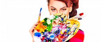
Every day, color surrounds every person everywhere, evoking unique feelings and emotions. The choice of interior and household items, accessories, improvised means, clothing, and everything else according to the shades of the color palette indicates the personal preferences, internal sensations and state of mind of the individual. Also, personal preferences for colors characterize the mood of the upcoming event or temperament.
The choice of color tone radically affects the psycho-intellectual state of the individual. Psychologists have determined that an environment with a restrained color scheme attracts, calms, promotes a creative atmosphere, and improves communication between people. Color tone can influence feelings, not logic. Studies have proven that 80% of color is “absorbed” by the nervous system, and 20% by vision. There is a certain relationship between color and perception. It has been truly established that every color tone has subconscious associations. Color, like shape, has an emotional impact on any personality. It can instill feelings of comfort and peace, attract or repel, disturb or excite. This can be clearly observed when leafing through booklets, watching good advertising films or looking at posters, glancing at the expressive spatial and color solutions.
The meaning of color in psychology
Scientists have concluded that 80% of the color flow is perceived by the nervous system, and only 20% falls on the organs of vision. What does this mean in practice? If you have developed a habit of reacting to red with anxiety since childhood, the reaction to this color will be a feeling of danger. If red prevailed as an attribute of the holiday, you will react to it with joy.
Green will allow you to relax and move forward confidently. Each color carries with it subconscious associations and evokes certain emotions:
brings a feeling of comfort and peace causes sadness or joy fills with a state of anxiety or excitement repels or attracts
The perception of color changes depending on the psychophysiological state of a person. If you are very tired, you won’t even notice what color your colleague is wearing. In case of danger, colors will be perceived sharper and more distinctly, etched into memory. And, conversely, color flow has an impact on your mental and physical well-being. In a hospital room whose walls are painted black, you are unlikely to recover quickly. It is not for nothing that white is used in medical institutions - a symbol of cleanliness and health.
Yellow
Yellow is a bright, stimulating color that increases concentration, improves memory, organizes, and promotes quick decision making. Helps understand new ideas. Yellow is the color of the sun, energetic, but without aggression, the color of optimism, freedom, openness, mobility, sociability. Adjusts for communication skills. This color is openness and sociability. Helps to bring balance to emotions, find inner peace, and pacify emotional excitement.
People who prefer this color do not like fools, they like to be admired, they do not like to be driven into a corner. They are characterized by high self-esteem, self-confidence, and activity. The color yellow can “endow” an object with intelligence. This color will be successful in advertising high-tech products, goods for children, travel agencies, and advertising agencies. It is often used in food packaging, in particular bread, flour products, and cereals. Causes positive associations in advertising.
Possible negative associations: At the level of stereotypes, there is an opinion that Yellow is the color of separation. Yellow can also evoke associations associated with jealousy, envy, condemnation of others, “The Color of Gossip” (yellow press).
The relationship between color and human character
Depending on where the colors are used, a person makes a choice in favor of one, or at most two or three. Preferences may change over the course of a lifetime. This happens if you find yourself in an unfamiliar environment, in a different emotional background. In other words, your favorite color will reflect your character and communication skills.
Have you not paid attention to the fact that owners of yellow and red cars are by nature life-loving and tend to consider themselves lucky? People who are balanced in character are drawn to blue cars. Owners of white cars have a conservative view of the world, while black cars are preferred by purposeful and business people. You may not agree, but psychologists say that proud people especially pay attention to silver and gray cars.
It is not necessary to conduct a psychological test to understand individual character traits. It is enough to analyze the color scheme of clothes, things and objects that surround a person.
Red
A controversial color with an ambiguous meaning. First of all, it is a symbol of greatness and power. It has been noticed that even sports judges tend to give leadership to athletes in red clothes. In Byzantium, only patrician women were allowed to wear red shoes decorated with precious stones. Ordinary people wore black leather shoes.
A victorious color is psychologically perceived as aggressive and excites thoughts. In advertising or in road signs, it plays the role of a “master”, encouraging one to perform one or another action.
Blue
Blue is a concentric color, it dedicates everything only to itself. This color has “no bottom”; it never ends, pulling you into itself. Blue color is constancy, perseverance, perseverance, devotion, dedication, seriousness, rigor. It has a very strong psychological value, being the color of persuasion, but not as emotionally oppressive as red. Symbolizes eternal values, height and depth, wisdom and rigor. Dark blue color is considered businesslike, professional and authoritative - it’s not for nothing that businessmen love it so much. Helps you concentrate on what is essential. A blue detail in a catalog or advertising brochure will immediately attract attention, but unlike red, it will almost never cause negative emotions.
Possible negative associations: Blue is not only the color of the sky, but also the color of the night; it can be associated with magic, strange things, witchcraft, oppression, fanaticism.
Golden
The golden color symbolizes luxury, radiance, sun, impeccability. Represents the desire for power and demonstration of one's superiority. Gold is the color of work, career growth and wealth; as a rule, it is used in combination with other colors to give them greater significance and shine. Gold is one of the most dangerous colors; using it in large quantities can turn elegant luxury into bad taste. People like to use it on packages of coffee, tea, and cigarettes; psychologically it makes the taste “rich.”
Possible negative associations: Gold can be perceived in completely different ways, causing associations of wastefulness, excessive idleness, and bad taste.
Black
Black always hides everything it carries, being the most “mysterious” color. Balances white color (without darkness there is no light, yin and yang). Correlates with infinity, helps to concentrate and isolate oneself from all extraneous colors. In its pure form, it is used quite rarely, because... causes negative emotions. It is usually paired with warmer, brighter colors to create more contrast. Black color is classic; black suits for men are an integral part of business style. Indispensable for creating clear shapes and lines.
Possible negative associations: Causes a feeling of bitterness, heaviness, despondency. Often associated with mourning. In this case, combining it with red can help; it will add dynamics and aspiration to black.
Vital activity
A representative of the stronger sex who prefers dark red shades is not uncommon today. Long gone are the days when men tended to choose dark colors. Now everyone is free to act according to their individual taste. As a rule, extraordinary individuals tend to dress brightly and look for additional perspectives that would allow them to more fully express their personal qualities. Life activity forces a person to move a lot, to feel the need to try to build life according to his own scenario, and not to adapt to those around him. Such an individual is not afraid to experiment and often makes completely rash decisions. If at some point something goes wrong, he can admit the mistake, although such a decision is not easy for anyone.
Determination
In psychology, burgundy color denotes the desire to achieve a significant result at all costs. Such a person will not stop at any obstacles. Even if things don’t work out the first time, firm attempts will follow to change unsatisfactory circumstances. This is actually quite commendable, especially if an individual does not give in to difficulties, but tries to overcome them as quickly as possible. Determination is a significant trait of a strong person. Self-confidence needs to be built up; it is not built in one day.
If an individual clearly understands what he wants to achieve as a result, then he will act meaningfully, without much thought or hesitation. Sometimes you notice an interesting trend: with a change in wardrobe comes tangible personal growth. A person begins to think and feel differently, and this forces him to further develop in the chosen direction and engage in self-improvement. If everyone believed in themselves enough to stop obsessing over the little things, the world would truly change as a result.
Burgundy
The color is formed by mixing red and brown. It has a deep, rich hue , which is calmer in effect than bright red. Does not cause severe stress to the nervous system.
Burgundy, the color of the elite, is chosen by people endowed with conservative qualities and representatives of the business sphere.
Speaks of confidence and solidity . They are good organizers, but at the same time stingy with emotions.
Burgundy is used in clothing. It also looks good in the interior, creating a feeling of solidity and wealth.
Оттенки Р±РѕСЂРґРѕРІРѕРіРѕ S†РІРµС‚Р° РІ онтерьере
РџРѕРєР° РЅРеРєРѕРјСѓ РЅРµ удалось РґРѕ РєРѕРхца разгадать тайРхСѓ загад RѕS‡РЅРѕРіРѕ Р±РѕСЂРґРѕ. Зато Сѓ дизайнеров получилось выделить несколько РѕС ‚тенков цвета. Р' таблице РІС‹ найдете основные варРеации.
| Название оттенка | Характеристика |
| Марсала | R“ранатовый оттеноRє SЃ SЏРІРЅС‹Рј RєРѕСЂРёС‡РЅРµРІС‹Рј RїРѕРґС‚РѕРЅРѕР ј |
| R'ургунди | Глубокий красно-бордовый |
| RљР°СЂРјРёРЅ | Насыщенный темно-красный СЃ коричневыми Рхотамми |
| Мерло | РўРѕРЅ, максРемально R±Р»РёР·РєРёР№ Рє RєРѕСЂРёС‡РЅРµРІРѕРјСѓ |
| Р'урый | Приглушенный оттенок СЃ преобладанием RєРѕСЂРёС‡РЅРµРІРѕРіР * |
| Сангрия | Ярко-бордовый с выраженными красными нотамми |
| Кардинал | Оттенок СЃ лидирующими SЏSЂРєРѕ-красными тонами |
| RўРµСЂСЂР°РєРѕС‚Р° | RњСЏРіРєРёР№ тон СЃ выраженной рыжинкой |
Однако РЅР° выборе оттенка дело РЅРµ R·Р°РєР°РЅС‡РёРІР°РµС‚СЃСЏ. Следующий этап РЅР° пути Rє SЃРѕР·РґР°РЅРёСЋ SЃС‚ильного дизайн-РїS ЂРѕРµРєС‚Р° — рассмотрение вариа S†РёР№ РёР· спектра SЃРІРµС‚лых Рё темных тонов.
RЎРѕРІРµС‚! РќРµ стоит сочетать РІ интерьере RѕРґРЅРѕР№ комнаты боле Рµ РґРІСѓС… оттенков цвета. Р'ажно, чтобы тона соотносились RјРµР¶РґСѓ СЃРѕР±РѕР№, создава R»Рё РёРіСЂСГ, дополняли РґСЂСѓРі РґСЂСѓРіР°.
Who is it suitable for?
Burgundy, like all varieties of the red spectrum, can be unnerving and irritating if too much of it. The human psyche automatically perceives it as a danger signal, so it needs to be “extinguished” with other shades. When choosing clothes for an image, stylists focus on your body type and individual style. Psychologists recommend adding a sense of personal comfort to these criteria: the chosen colors should not evoke unpleasant emotions. The main designation of burgundy is vitality and an active life position. If a passive person chooses such an outfit, he will feel out of place.
The red spectrum looks best on girls with dark skin: it does not create a sharp contrast and gently emphasizes the skin tone. Girls with fair skin prone to redness need to use it carefully: against its background, the skin becomes pinkish and looks unhealthy. To avoid this, you need to reduce the amount of burgundy in the ensemble, assigning it the role of color for accessories.
Grey
Gray color connects white and black, forming a harmony of two opposite colors. Neutral in itself, it has a subtle beauty, especially when combined with bright colors. Gray is the color of intelligence, it relaxes and helps you feel calm. It is universal and conservative, can be used in almost any field of activity to create brevity and sophistication.
Possible negative associations: Gray can be associated with bad weather, illness, feelings of uselessness, melancholy, and fatigue. His capacity for peace may be replaced by a feeling of endless melancholy and sadness. It is rarely used when creating packaging for detergents, shampoos, and hygiene products, because... in the psychological perception of people, gray is the color of the city, modern offices, asphalt, dust, but not shampoos.